DocsBlender manualUser InterfaceUI Elements
Decorators
From the Blender 5.2 LTS Manual by the Blender Documentation Team, adapted for Angelo · CC BY-SA 4.0
Decorators are small buttons that appear to the right of other buttons and show the state of the property. Decorators may appear next to number fields, menus, and checkboxes to indicate the property can be animated.
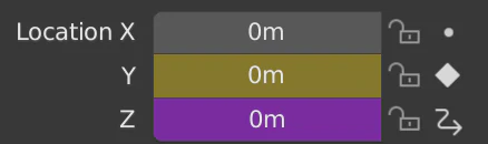
Decorators indicating different property states.
Clicking on the decorator dot icon will add a Keyframe to that property. Clicking the rhombus icon again will remove the keyframe. A solid rhombus icon indicates there is a keyframe on the current frame, while a non-solid rhombus icon indicates that the property has a keyframe on another frame. Clicking the non-solid rhombus icon will create a keyframe on the current frame with the current property value.
If a property is being driven by another, the decorator shows the driver icon.
Decorators make it quick and easy to glance over properties and see their state.
See also