DocsBlender manualUser InterfaceUI Elements
Color Picker
From the Blender 5.2 LTS Manual by the Blender Documentation Team, adapted for Angelo · CC BY-SA 4.0
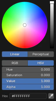
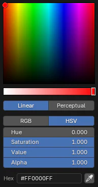
Circle HSV color picker.
The Color Picker is a pop-up control that allows you to define and adjust color values. It appears when editing any color property in Blender, such as materials, lights, brushes, or interface themes.
The color picker provides multiple color models and interaction modes to suit different workflows, and can display or edit colors in both linear and perceptual (display-referred) color spaces.
Interface
- Color Picker
The large color field lets you pick two color components at once, depending on the selected picker type. The third component (such as value or saturation) is controlled with a slider next to the color field.
The picker’s appearance and behavior depend on the type chosen in the Preferences; see Types below.
- Value/Lightness
The vertical slider with a gradient background defines the brightness or lightness of the selected color. You can scroll the Wheel for fine adjustments or click and drag the handle.
Below the color picking widget are a few options, the first affects how the color component’s values are computed.
- Linear:
Displays color component values in the scene’s linear working color space used internally for rendering and compositing.
- Perceptual:
Displays color component values in the color picking space (sRGB by default), which matches the visual appearance of the color widgets and is more intuitive for user selection.
The next set of options change the Color Model that is used. The available options depend on the Color Picker Type.
- RGB:
Defines a color by directly mixing Red, Green, and Blue components.
- HSV/HSL:
Defines a color by adjusting Hue, Saturation, and Value (or Lightness). Useful for adjusting color tone and intensity independently.
- Component Values
The numeric fields below the picker show the component values (RGB or HSV/HSL). Blender expresses these in the range 0.0 to 1.0. For color inputs that include an Alpha Channel, an additional slider and field are shown.
- Hex
Displays or accepts the color’s hexadecimal (hex) representation. Hex shorthand notation can be used (for example,
FC0forFFCC00).Note
Hex values are automatically Gamma-corrected for the sRGB Color Space. For more information, see Color Management.
- Eyedropper
Samples a color from anywhere inside the Blender window using the Eyedropper.
The sampled colors are read in linear color space, so they do not account for display transformations such as view or exposure adjustments. Sampling colors from overlays, reference images, or video preview regions may be inaccurate since those may be drawn after color management transforms.
Shortcuts
Ctrl-LMB (drag): Snap hue to 30° intervals.
Shift-LMB (drag): Fine-tune color movement for precise adjustments.
Wheel: Adjust value or lightness.
Backspace: Reset the current value to its default.
Types
The Color Picker Type determines how colors are visualized and selected. Different picker types offer alternative layouts for adjusting hue, saturation, and value components. The choice is a matter of personal preference and workflow.
You can choose the default picker type in the Preferences under Interface Preferences.
|
Circle HSV |
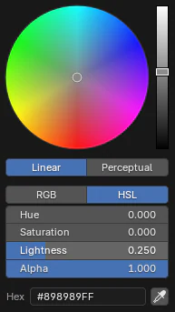
Circle HSL |
|
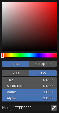
Square (SV + H) |
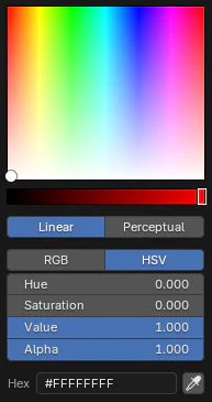
Square (HS + V) |
Square (HV + S) |
Notes
Blender internally works in linear color space; conversions from sRGB or other spaces happen automatically.
The color picker displays the color as it appears in the current view transform, but the stored value remains linear.
For consistent results across renders and display devices, see Color Management.